Fantasy Portrait


Victoria Gallardo Fantasy Portrait - Yves de Contades
Victoria Gallardo, Founder & Creative Partner, Creative Orchestra:
In advertising they say the pen is mightier than the sword. I'll take on anyone armed with a pen. And watch them run!
Dr Cecilia d'Felice's psychological interpretation:
- Read more about Victoria Gallardo Fantasy Portrait - Yves de Contades
- Log in or register to post comments

Trevor Chambers Fantasy Portrait - Yves de Contades
Trevor Chambers, Executive CD, Start Creative:
- Read more about Trevor Chambers Fantasy Portrait - Yves de Contades
- Log in or register to post comments

Tom Evans Fantasy Portrait - Yves de Contades
Tom Evans, CD, Sapient Nitro:
Keep it simple
Dr Cecilia d'Felice's psychological interpretation:
This relaxed composition suggests a man who is at ease with himself and the world. In this monochrome there is a sense of nostalgia, redolent of times less frantic and a chance to sit, talk and think.
- Read more about Tom Evans Fantasy Portrait - Yves de Contades
- Log in or register to post comments
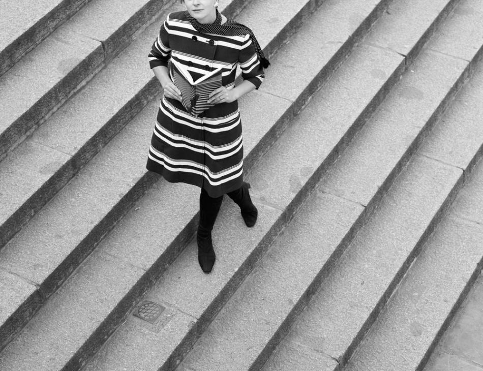
Suzanne Dean Fantasy Portrait - Yves de Contades
Suzanne Dean, CD, Random House:
Rodchenko wrote: "One has to take several different shots of a subject, from different points of view and in different situations, as if one examined it in the round rather than looked through the same key-hole again and again."
I took inspiration from my love of Rodchenko’s innovative, graphic photographs. I wanted a portrait that was both simple and complex at the same time. That incorporated his use of contrast and experimental perspective.
- Read more about Suzanne Dean Fantasy Portrait - Yves de Contades
- Log in or register to post comments

Stuart Dickinson Fantasy Portrait - Yves de Contades
Stuart Dickinson, CD, FutureBrand London:
- Read more about Stuart Dickinson Fantasy Portrait - Yves de Contades
- Log in or register to post comments
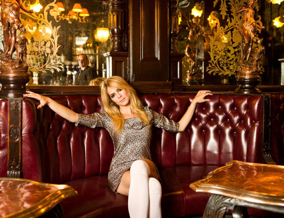
Silas Amos Fantasy Portrait - Yves de Contades
Silas Amos, CD, JKR:
I‘ve long admired Gered Mankowitz’s portrait of Marianne Faithful (taken in the equally beautiful Salisbury Pub) for obvious reasons - but also because I love the guy in the mirror, caught staring for all eternity. As a camera-shy wallflower, I thought paying homage to this great original would mean I could bask in some reflected glamour, and would happily pass an hour at the bar. It did.
(with thanks to the Salisbury pub and M and P models)
Dr Cecilia d'Felice's psychological interpretation:
- Read more about Silas Amos Fantasy Portrait - Yves de Contades
- Log in or register to post comments

Roy Wylam Fantasy Portrait - Yves de Contades
Roy Wylam ,CD, Kirk Wylam:
The reason I chose this particular theme, in the style of the great Hollywood photographer Laszlo Willinger, is I am always in my own design work drawn to strong contrast, and this style of photography so well taken by Yves, produces a strong, memorable result.
Simplifying the picture to black and white always helps to exemplify this contrast and bring out the character of the subject, producing dramatic results.
- Read more about Roy Wylam Fantasy Portrait - Yves de Contades
- Log in or register to post comments
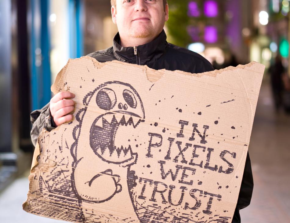
Rob Heasley Fantasy Portrait - Yves de Contades
Rob Heasley, CD, Naked Penguin Boy:
When deciding on my portrait these are the few things I wanted to portray: Set in a central London location as London has been good to me. Night is when the city is at its best. I’m colour blind & I liked the idea of being surrounded by colour with the blurred out city lights.
The cardboard illustration was basically about where my career began & where it’s at now, going from traditional illustrator to digital designer (in pixels we trust).
Dr Cecilia d'Felice's psychological interpretation:
- Read more about Rob Heasley Fantasy Portrait - Yves de Contades
- Log in or register to post comments

Richard Scholey Fantasy Portrait - Yves de Contades
Richard Scholey, CD, Elmwood and Chase Advertising:
I consider myself very lucky to be able to make a living doing a job I enjoy. Yes we perform an important function but it can all become a bit irritating when we take ourselves too seriously or think we are some sort of celebrity. At the end of the day our job, certainly from a graphic designers perspective, is simply to aid communication, to tell stories and to do it in as visually engaging a way as we can. If it’s appropriate and we can raise a smile at the same time then all the better.
- Read more about Richard Scholey Fantasy Portrait - Yves de Contades
- Log in or register to post comments


